-
Posts
2381 -
Joined
Content Type
Profiles
Downloads
Forums
Events
Gallery
Everything posted by NodSaibot
-
It's a bug in the serverlist. It doesn't update constantly. Don't always have to assume the worst
-

server How do you setup a server with friendly fire?
NodSaibot replied to LeonardMT's topic in Technical Support
You'd have to replace the mammoth with a new mammoth, but the mammoth weapon is Rx_Vehicle_MammothWeapon would be the bonus missiles -

server How do you setup a server with friendly fire?
NodSaibot replied to LeonardMT's topic in Technical Support
Well the character sounds in-game are not setup for friendly fire. -

server How do you setup a server with friendly fire?
NodSaibot replied to LeonardMT's topic in Technical Support
From old UT? I don't know. If there's stuff for friendly fire, it might be from BD. RenX has never had friendly fire from my knowledge. -

server How do you setup a server with friendly fire?
NodSaibot replied to LeonardMT's topic in Technical Support
The game isn't coded for friendly fire. And to change it, you'd have to recompile the mutator. 0.5 = 50% dmg. -

go to first unread post. Barely visable.
NodSaibot replied to isupreme's topic in Feedback & Bug Reports
The theme will be changing at some point in the near future.- 1 reply
-
- 1
-

-
However we are releasing Firestorm Assault gamemode to the public this summer!
-

FIX candidate: Repair gun visual bug
NodSaibot replied to Suspiria's topic in Feedback & Bug Reports
How could repair guns/beam weapons cause EMP fields/grenades not to display their particles? -

FIX candidate: Repair gun visual bug
NodSaibot replied to Suspiria's topic in Feedback & Bug Reports
We must be talking about different bugs then -

FIX candidate: Repair gun visual bug
NodSaibot replied to Suspiria's topic in Feedback & Bug Reports
I don't see it anywhere in the newest patch notes. The particle bug is far more broad than just the repair gun itself. -
Because people don't want it. While I'd love if we could make the game perfect, with the current workforce we have, if we spent all time trying to perfect RenX, FS wouldn't come out in our life times.
-
If it's giving you issues with a specific folder, try deleting the whole patch folder and starting the launcher again.
-
I'll take a look at it. We had some interesting progress regarding XAudio stuff as well. https://github.com/TotemArts/RenegadeX-Extensions
-

Download stops at 98.98% what is the problem
NodSaibot replied to Kirby550's topic in Technical Support
We are aware of the issues, a new launcher is being built currently and will be released when it's sufficiently tested and ready. -
Shaping up nicely!
-
Will most likely be reverted in an upcoming patch.
-
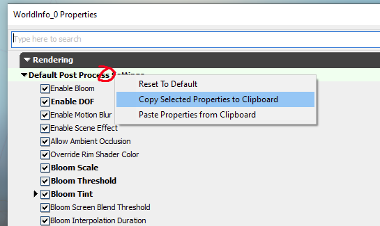
Getting the lighting/overall visual appearance of a map can be difficult. There are many factors, obviously first being the lights themselves in the map. Post process settings and lightmass settings in the world info are also important, specifically these can help fine tweaking contrasting/shadows, which can help a map feel less bland. Something that I find fun, is to open other maps and see what it looks like on your map if you copy over post processing/lightmass/lighting/fog settings. You can then tweak it further to fit your map specifically. This can be easily achieved by literally just opening another map, finding the main light(s) and copying them, then just pasting into your map. For the post processing/lightmass settings, you can right click the top of the section and copy the settings, paste it into a notepad, open up your map then right click and paste the same section on your map's world info. Besides the map itself, you can also change some material parameters to make specific assets look better on your map. Disclaimer: I'm not a mapper nor an artist. That being said, I have done a fair amount in the map editor, so this is really just what I picked up over that time.
-
"Welcome Back, Commander" With the winter season coming to a close, our seasonal maps are now returning to their normal decor. The map Toxicity is now making its official return back into the game!
-
P.S. if the server owner looks at this post Go to UDKGame/Config/UDKRenegadeX.ini and set TimeLimit to the match duration you want in minutes.
-
Any download?
-

Question: Do Settings Still Reset Per Patch
NodSaibot replied to Newbie's topic in Feedback & Bug Reports
Depends on if we add any new settings or some changes to the default configs per patch as well. -

Question: Do Settings Still Reset Per Patch
NodSaibot replied to Newbie's topic in Feedback & Bug Reports
There have been no changes to fix this issue.


