-
Posts
2008 -
Joined
-
Last visited
Content Type
Profiles
Downloads
Forums
Events
Gallery
Everything posted by Handepsilon
-
@once upon the time Please stay on topic. We're neither discussing Veterancy Point nor Commander Point @Mystic~No need to provoke an argument As for differing Vehicle and Infantry repair, it's a bit unnecessary I think. Here are my reasons A new class would require some more HUD retweak because as of now, adding new class is impossible due to the lack of space in the visual HUD A new item would probably be OP, depending on the method. I agree that infantries seem quite powerful, or at least, has the potency to feel more powerful in the right player against other infantries. They have a fairly high skill ceiling, so any attempt to add specialized healing would have to take that into account Not sure if any of our modeller is willing to make new model for that (blueprint doesn't count. It's literally a sheet of paper with extra polys)
-
Like the new HUD Among many other things To an extent, while I myself am sad that putting custom maps in official servers get shunned upon, I do understand the complaints about the download speed. I'm pretty sure there's that launcher feature being developed there somewhere down the line but has never been realized at all. When we first have the whole RenX SDK, it was even worse, there wasn't any repository at all that anybody who can't instantly download 100 - 200 MB worth of map within the span of what, 12 seconds? Anyway, they were forced to restart the download at the unbelievable speed of 10 KBps. There was literally no way to test Eyes or Hourglass in prime number, and that prime number was 40 when it came out Even to this day, I myself am still stuck with slow download that ranges between 200 KBps or if I'm lucky enough, only a little more than 1 MBps. In any case, yeah. Custom maps put in public has serious issues because not all people bothered to browse through the forum/different discord servers for custom maps, and download speed during game time is iffy for people with low netspeed. Then there are people who just couldn't be bothered to go all technical sending the maps/packages on correct locations and mess things up Really, the only plausible way to test custom map in quite a dependable way is by sending it to official patch, and while I myself am more than welcome to add more maps in as some sort of trial (and to add more flavor than the constant match of Under/Field/Walls), I can see others who might be even more critical/skeptical within the dev team. tl;dr : Custom contents are encouraged, but the environment is just too tedious. The nature of UDK also doesn't help that much
-
I don't think VP bonus would be enough. It's a nice start, but even taking VP out of the equation, the game just has too many rewards in the offense portion : - Tech building - VP bonus when killing enemy people inside their own base (in fact, you get *penalized* for doing the opposite) - Crates - Harvester shots (sans Island or Complex)
-
This to me sounds like one of the most nonsensical radio command to exist in the base game. Friendly fire has always been off (was told it was even *hardcoded* that way), and unlike Unreal Tournament, getting hit by friendly explosives (or any explosives) doesn't launch you to potential pit of doom. Would've been more sensical if the quote was "Hold your fire" or something
-

[Poll] Team Switching Punishment
Handepsilon replied to LavaDr4gon's topic in Feedback & Bug Reports
well ideally it should only be when you login back to your team. Thing is that there's no telling whether or not it's a crash, ping disconnect or just legit quitting -

[Poll] Team Switching Punishment
Handepsilon replied to LavaDr4gon's topic in Feedback & Bug Reports
My initial idea for the punishment, because it doesn't make sense to also punish the team they left I guess the other takeaway is that there's no real easy way to do this while also having the credit recovery after disconnect existing -
I've checked. There seems to be nothing wrong with the script themselves However, the funny thing is that Power Plant death multiplies the price by 1.5x, not 2x. It would only be the case if the game thinks your airdrop is active. The takeaway is if you try to purchase, it might still decrease your money like how it should've been (not twice the cost) because the purchase is handled server-side
-
Time to look at the Purchase System
-

New HUD Poll - Chat / Kill logs position
Handepsilon replied to Handepsilon's topic in Feedback & Bug Reports
Not anymore, you now have to press tab... which I've promised so that it would not induce lag. Again, though not the topic atm. Use the other thread -

New HUD Poll - Chat / Kill logs position
Handepsilon replied to Handepsilon's topic in Feedback & Bug Reports
Yes, because the radio commands of 'Building needs repairs' don't really say *which* building needs repairing. Yeaaaaah wouldn't that just create clutters all over your screen instead? There really is no place for it, and I still don't know how to make them tween nicely with the current setup we have, which dynamically adds the icon as opposed to just having a fixed 5 slot and then hide the ones that's not present AS A FRIENDLY REMINDER we're here discussing about the chat position, not the HUD overall. If you have any other complaints about HUD elements, refer to this : -
Apparently UDK seems to be loading its' mutator info for its' menu in a similar way that we set up the map info. So I guess it's doable. I just need to familiarize myself with the whole UIDataProvider stuffs
-

New HUD Poll - Chat / Kill logs position
Handepsilon replied to Handepsilon's topic in Feedback & Bug Reports
You and I both know that is not possible at all. When I handled the HUD it's already detracted from the HUD we had And unless you're willing to take the job, we got no one in the mood of reverting all the changes in other classes that gets hooked up by the HUD functions and variables, all the while preserving the optimizations that I've set up so that the HUD doesn't eat as much memories as it did -

New HUD Poll - Chat / Kill logs position
Handepsilon replied to Handepsilon's topic in Feedback & Bug Reports
Well I wanted to say that 'no, we can't do that', but then I took another re-look and seemed to have found a solution that works.... at least for a monitor with big enough screen. Scaling is possible, but people with lower res will be more likely to see specks -
So it's been weeks now since the release of the new HUD. So the question now is, should we keep the current position of chat log/kill log or would you like it being reverted? In the long run we'll probably try to have this portion customizable, but before that happens, we'll have to stick to fixed position. P.S. :We'll probably still keep the separation of normal chat and radio though, but keep the feedback going regardless
-
when we can actually edit our current menu, perhaps Thing is, I'm trying to setup a simple Settings menu and it pretty much only result in dysfunctional Main Menu UI and crashes
-
There's that Multiplayer menu that works almost like Skirmish. It's kinda low-support because not enough of us scripts the menu (I think?). Setting up your own server is much more versatile, but you'd have to meddle a bit with some command lines. It's available for anyone as long as you can port-forward (unless you're playing LAN) To make things as versatile as you put it without the use of Mutators would really require some rescripting of game logic though, and honestly I'd prefer just using mutators. We just need a way to make a configurable mutator, which is not exactly hard. The hardest part is actually making a menu for it. EDIT : Actually nvm, apparently it doesn't have the capability
-
Ah, I see. it's related to the passenger list bug Does this happen to non-multiweapon tanks btw? Could be related
-
That's what I said lol
-
That part should be fixed now lel
-
I'm actually not really unconvinced if the icon doesn't pop up. There are still some points that seem to be iffy, such as the passenger names. Does the passenger name bug out when this happens too? If it does, try switching seat back and forth, see if it fixes the icon too
-

The Position of polls dilutes the commander's voice
Handepsilon replied to isupreme's topic in Feedback & Bug Reports
Some polls are actually important though (such as kicks). Also, aren't commanders able to utilize Commander text that pops on the center too? I always thought that the very center of the screen is the most important stuff because your eyes will always naturally go there first and foremost -
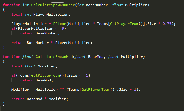
It's less about scaling and more on how the base game works (this is also the reason why low pop games really sucks if you can't attack). A pair of recon bikes can already cause one player to scramble. If I really want to make it 100% viable for single player, I'd be removing all kinds of vehicle wave in the game mode when there's only one player.
-
This is what it currently is like atm The problem here is because you need to keep buildings repaired while also taking out the tanks taking shots at the building. One player cannot do both, so you have to rely on base defenses and support power doing the thing
-
Lone wolf defense is hard... but not impossible. At least not until Wave 12. I've actually managed to survive that long on my own. Just spam those reinforcement and you should be good lol
-
*but it already is*

