Gnougnou
-
Posts
4 -
Joined
-
Last visited
Gnougnou's Achievements
")
Newbie (1/14)
4
Reputation
-
[Feedback] First Game as an old C&C Fan
Gnougnou replied to Gnougnou's topic in Feedback & Bug Reports
So be it then ! I've never been a huge fan of the first era anyway. I have great memories of the single player, but that's pretty much it. I hope you guys are gonna rock the TS version. TS really was amazing. I'm glad you changed his mind, because the interface from the dev blog is way better. -
Direction inverted when traversing backwards in vehicle
Gnougnou replied to GroundBird's topic in Feedback & Bug Reports
Good to know ! I also found it to be weird. -
[Feedback] First Game as an old C&C Fan
Gnougnou replied to Gnougnou's topic in Feedback & Bug Reports
After watching the Dev Talk #3, I realize that the menus are getting revamped and are getting similar to what I suggested, with icons and a "detail" box for the selected class. This is a step in the right direction. Not how I would have done that, but definitely better than in the current game. EDIT : Now that I think of it, the possible reason it feels more natural to have all the infos on the left and the soldier on the right might be because we read from left to right, so we expect the important stuff to be on the left. When you open the menu, you immediately look left, only to find your soldier, and THEN proceed to look right to select your kit.
-
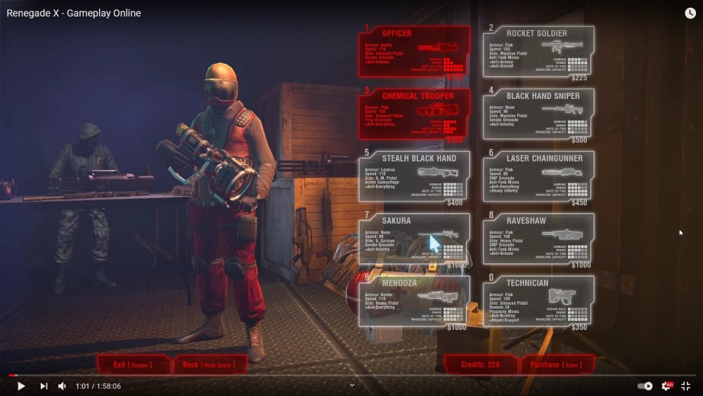
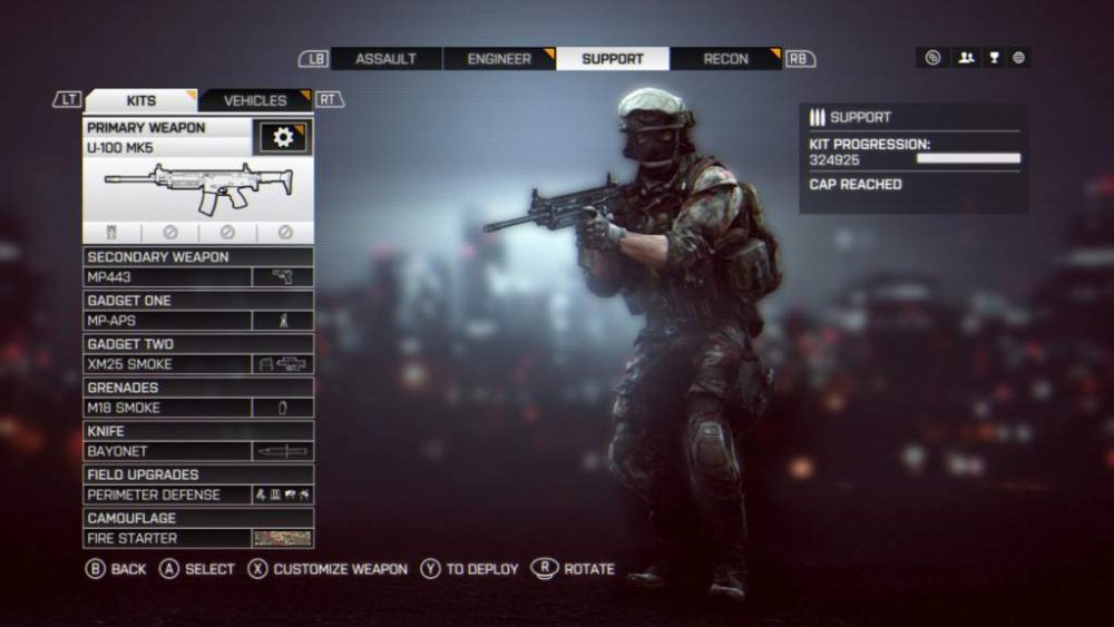
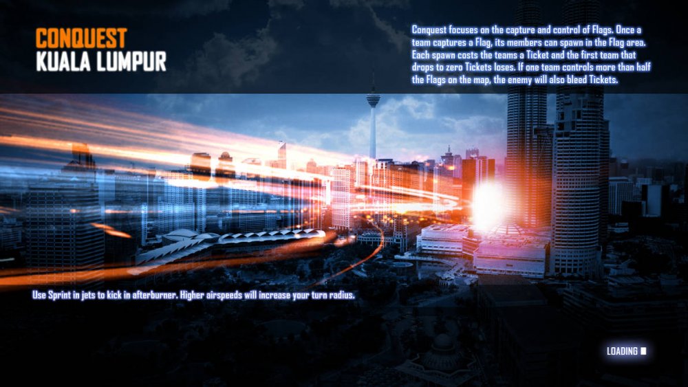
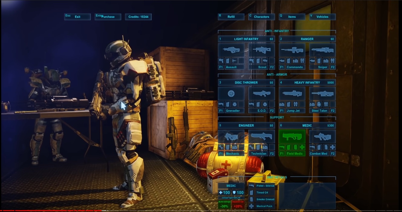
Hey everyone, I just heard about the game, and especially Firestorm, and decided to give your game a go, as an old C&C fan (all of them really). This is all I think could be improved inside and outside of the game. 1. How I discovered the game : First things first, I discovered the game via a random recommanded video on Youtube of Renegade X : Firestorm. I think it was some gameplay from the Beta or something. As a huge fan of the second era (Tiberian Sun), I wanted to try the game. I typed "renegade X" on google and found this website. 2. The Website : Landing on the website, my first thought was "Is this 2000' ?". The website doesn't make me want to play the game. The banners are very average, and the overall skin of the website looks like any Counter Strike team back in the days. It's not a bad website, but it's more of a "geeky" website with all updates & stuff. Only the very top banner "Renagade X" is fine IMO. The only reason I pushed through is because I'm an old Renegade player, but the average joe is very probably gonna ignore the game. Good examples of promoting websites are : https://www.eveonline.com/ https://www.callofduty.com/warzone Those websites are clean, modern, allow you to quickly access the download button, watch a trailer, etc. I don't know your players' demography, but I would take the bet that people that played Renegade back in the days now have families. You gonna have to bring people that probably never ever played a C&C before. 3. First Game : After downloading and installing the game without any issue, I joined the most populated server. First remark : The loading screen should always tell you the objectives of the gamemode. Sure, game tips are good, but for a non-Renegade player, wtf is he supposed to do ? BF3 Loading Screen : gamemode, name of the map, tip AND gameplay objectives. Landing in the game, I got earraped by Cabal and the money sound within the first 5 seconds, and I'm not even joking. As a C&C player, I knew what those sounds were, but imagine the surprise for a new player... Anyway, sound volumes were unnaturally unbalanced and I had to change them straight away. I then decided to order a tank. The shop menu is quite confusing because : Each box is too small for too many infos (damage, speed, weapons, etc). The text is red on a red background. Some loadout are in the main menu, some are in a dedicated sub-menu, and some items are in a third menu... From this screenshot, it's pretty obvious : The things you cannot buy are easier to read than what you can buy... Anyway, my advice would be to refactor the shop entirely : Soldier on the right and menus on the left feel more natural than the current layout (cf Call of Duty and Battlefield) Only one menu with ALL infantry kits. You could group them with sub selections, for instance "Assault" with the default soldier loadout + all characters that have machine guns, then same thing with all snipers/railguns, all rockets/anti tanks, all engineers... Remove all the infos from the boxes, and instead, display them somewhere only when the player hover the box or select something, with simple logos to represent "anti tank capability", "sniper" etc... It will make the menus so much easier to read and way, WAY more modern. It will help the player categorize all the classes/characters in groups (anti infantry, anti tank, engineer). BF4 loadout menu Looking at this BF4 menu, you could replace the "Primary Weapon" box by the character selection (default + all Renegade characters linked to that class) and their capability icons (rocket for anti tank, scope for a sniper, broken skull for anti infantry or whatnot). The rest of the game went on pretty OK, nothing much to add, it's very identical to Renegade. 4. Final Thoughts : The game is on the right path. It's clearly well made, and professional, but it's lacking the modern touch. I would argue that re-doing Renegade 1:1 is NOT what you should do since it's a very old game. Instead, you should aim at making it your own Battlefield, with pretty maps, cool gamemodes, random events during the game, modern UI, etc... I feel like this game is *this* close of being really good. Do not rely on people nostalgia as most of those players are probably older now and won't have time to play. Instead, try to market the game as widely as you can. Put yourself in the shoes of someone that never played Renegade and doesn't know anything about the Tiberium, and ask youself questions like "would I want to play this game and why ?". I'm looking forward to testing the firestorm addon ! Keep up the good work and good luck.